Pop-up Marker
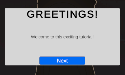
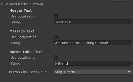
The Pop-up Marker is a built-in Marker that can display a custom title, message body, and custom button label. It also supports Unity Localization.
Settings
| Setting | Description |
|---|---|
| Header Text | The title text displayed at the top of the Pop-up |
| Message Text | The main content or body text of the Pop-up |
| Button Label Text | The text displayed on the interactive button |
info
The localization features require the Unity Localization package to be installed.
If you're looking for a guide to set up localization for your Markers, go here.
Button Configuration
The button in a Pop-up Marker can be configured to perform different actions when clicked:
Button Click Behavior
| Behavior | Description |
|---|---|
| Nothing | Button click has no effect |
| Next Stage | Advances the tutorial to the next Stage |
| Stop Tutorial | Ends the tutorial entirely |
| Invoke Unity Event | Triggers a custom Unity Event that you can configure |
Unity Event
When the Button Click Behavior is set to "Invoke Unity Event", you can configure custom actions to be triggered, such as:
- Calling methods on components in your scene
- Activating or deactivating GameObjects
- Triggering animations or other effects
Creating your own�
- In your scene, create the UI that you desire. It should have a Header, Body, and a Button.
info
Anchors must be centered. The dimensions of the UI do not matter.
- At the root of the object, assign a Pop-up Marker component
- You can also add it by clicking Add Component > Tutorial Master > Markers > Pop-up Marker
- Assign all of the UI elements as prompted
- Save your new UI as a Prefab
Follow this guide to learn how to add your new Marker and use it for tutorials.